
Great graphic design gives your brand the opportunity to stand out from the competition and leave a lasting impression on the minds of consumers. And while you can unleash your creativity to stand out, when it comes to creating something that will represent your business in the coming years, it’s best to be a little cautious.
If you’re just beginning on your graphic design journey, you may make some deadly graphic design mistakes that can mar your client’s business. We’ve rounded up three design faux-pas that make professional graphic designers cringe.
Using Wrong or Too Many Font Types
The font world is full of different styles and typefaces; deciding which ones to use can be a complex task. There’s a whole array of amazing fonts for both web and print applications, but there are horrible ones too.
Every time a graphic designer comes across a company using Comic Sans or Papyrus as their official fonts, it makes their skin crawl. It’s important to choose typefaces that look professional and reflect your brand’s personality.
Similarly, using numerous fonts will affect the readability of your message and make it look over-complicated. It’s better to stick with no more than two fonts while designing a brand’s message or creating a business logo. You may use a third font strictly for decorative purposes in some cases.
Oversaturated Colors
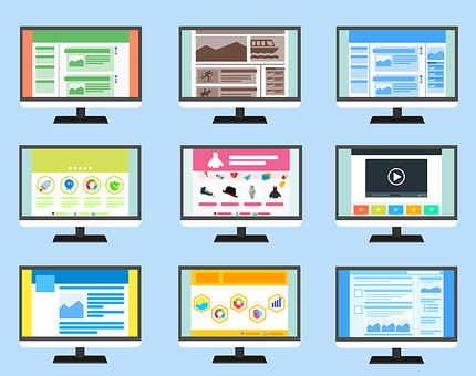
Saturated and bright colors in web design are popularly used to instill excitement and captivate users’ attention, directing them toward key content or an important message. However, if saturated colors are overused, they can cause distraction, deviating visitors’ attention from the site’s content.
To make it work, use saturated colors to accentuate places where you require a call to action. Disperse them by using dark, de-saturated or neutral colors such as black, white and gray around them to make them stand out.
Not Paying Attention to Letter Spacing and Typography
Many designers don’t care much about spacing between letters or characters (kerning), which is extremely crucial to effective design. A good kerning refers to when all the letters and characters are properly and equally spaced.
It enhances the visitor’s ability to read and understand the message. Whether you’re designing a webpage headline, a company’s logo, or just typing a paragraph text, it remains equally important through every aspect of graphic design.
If you’re looking to hire local graphic designers in Denver, CO, get in touch with Evna Design! We offer graphic design, logo design, and affordable web design across Longmont, CO.
Get in touch with us now to get started!